A Brief History of MBTA Transit Maps
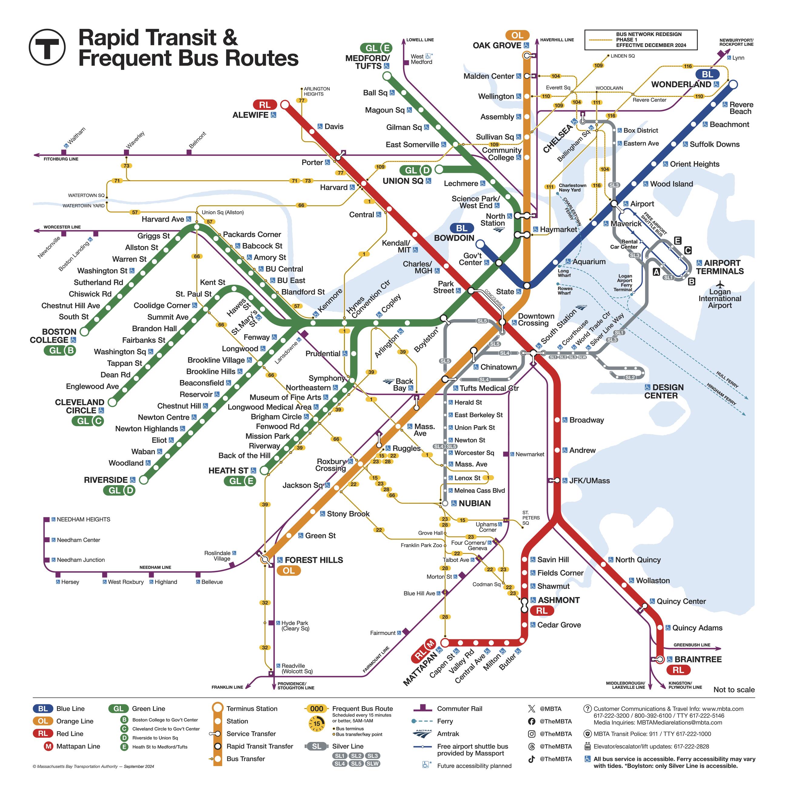
When Boston's Tremont Street subway opened in 1897, it ran through North America’s first subway tunnel. Since then, maps of Greater Boston have depicted the region’s subway, trolley, Commuter Rail, ferry, and elevated railway lines and bus routes. Cartographers and graphic designers have found many ways to illustrate our complex system to benefit locals and visitors alike. Here are some cartographical highlights of Boston’s transit systems, including a few that predate the founding of the MBTA.
The Pre-MBTA Era
The Boston Elevated Railway Company (BERy)

The Boston Elevated Railway Company (BERy) was founded in 1894, long before the Massachusetts Bay Transit Authority (MBTA) existed. In 1947, the Metropolitan Transit Authority (MTA) was established to consolidate much of Boston-area transit under one government entity. The MTA purchased and took over subway, elevated train, streetcar, and bus operations from BERy.
The Metropolitan Transit Authority (1940s)
When the MTA consolidated many transit services in 1947, fourteen cities and towns in the Boston area made up the original service area—Arlington, Belmont, Boston, Brookline, Cambridge, Chelsea, Everett, Malden, Medford, Milton, Newton, Revere, Somerville, and Watertown.
The growth of the suburbs (1950s)
During the MTA years, the Interstate Highway System was established, and car ownership rose dramatically. However, as many Boston workers moved to the suburbs, the transit system expanded to keep up with the increase in commuters. A variety of maps depicted the planned growth of the coverage area and the extensions of transit lines.
The MBTA Era Begins
The MBTA is established (1964)
The Massachusetts Bay Transit Authority, or the "the T," was established in August 1964. The MBTA took the place of the MTA and expanded the original 14 service areas to 78 towns and cities.
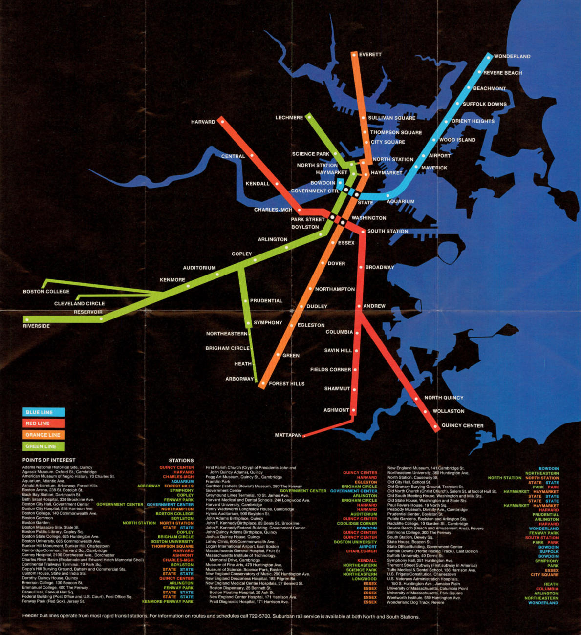
The "spider map” is introduced (1965)
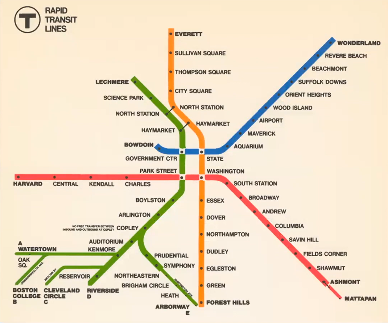
The 1965 “spider map” was the MBTA’s first dedicated rapid transit-only map, and the first to use the line colors as we know them today In 1965, the new MBTA created a transit-only map to make navigation easier. The so-called “spider map” didn’t superimpose subway lines on a drawn-to-scale map. It was a dedicated rapid transit map—a standalone schematic representation of the subway, elevated train, and streetcar lines that made up the T.
Cambridge Seven Associates (C7A) created the first MBTA spider map, a printed version that folded and fit in a pocket. It attempted to balance attractive design with accuracy and ease of use. The map showed Greater Boston’s subway fitting into a nearly square space, squishing Green Line branches A through E (we had an A Branch leading to Watertown then) into the lower left corner by omitting most Green Line stations.
The map’s Red Line ended at Harvard. To the south, the Red Line didn’t yet have a second branch leading to Quincy and Braintree. The Orange Line north of the city (through Charlestown and Everett) was still an elevated train line. So was the line along the Washington Street corridor in Roxbury, which was later moved.
Accuracy versus ease of use
Designers of the 1965 spider map and succeeding schematic T maps juggled the requirements of form and function. Riders wanted a design that was easy to understand, but accuracy and detail were compromised.
Early spider maps valued clean lines and symmetry over completeness. Arranging the system into a square was tidy, but the Green Line has many stops, some close together. Giving each station equal space made the map too wide, and short distances looked equal to long ones. Tight spacing left too little room for station names.
Older spider maps were easy to read, but they omitted many Green Line stations. Riders were often unable to find stations on portable folding maps. Today's transit maps include every station.
The spider map versus a traditional map (1967)

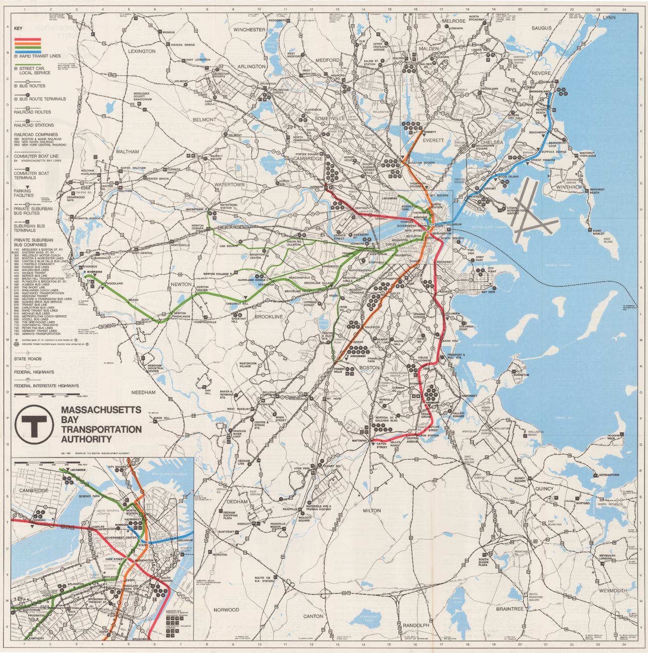
In contrast to the C7A map, a 1967 map showing the full transit system included not only the subway, streetcar, and elevated train systems, but also bus routes, Commuter Rail, “commuter boats” (ferries), parking facilities, and federal and state roads.
Though impressive in scope, this combination standard map and simplified spider map was short on details depicting transit in Boston proper. Its complexity emphasized the need for easy-to-use alternatives that met the requirements of transit riders.

What do transit line colors mean?
The legend that the colors of the lines are symbolic is partly true. The Red Line that once ended at Harvard is a nod to the university’s official crimson shade, and the Blue Line's watery color reflects its harborside location. But Green and Orange line colors and the purple Commuter Rail hue were chosen because they’re easy to differentiate on maps. In fact, orange wasn't one of the original colors—in user tests, C7A found it was easier for riders to see than yellow.
The Green and Orange lines received their colors at random, not to celebrate the “Emerald Necklace” of parks and waterways along the Green Line, or because the Orange Line once ran above Orange Street. The Commuter Rail’s signature purple was chosen in 1974 because it was the next bright color on the list.
Experimentation and Expansion Continue
Groovy colors and new angles (1970s)

The 1970s saw new map variations. A dramatic 1974 map makes transit lines pop against a black and blue background featuring the region’s waterways. It’s eye-catching, but current accessibility guidelines require dark letters on a white background.
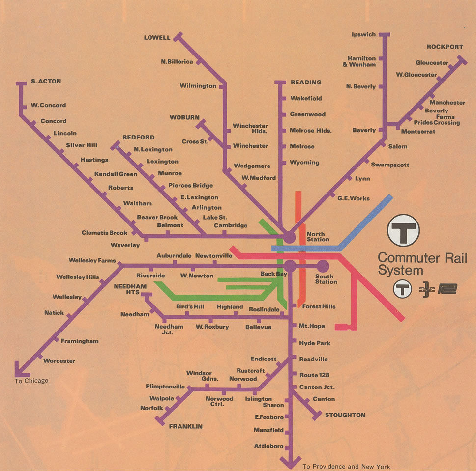
All hail the Commuter Rail
During the 1960s, the MBTA subsidized existing rail operations provided by private railroad companies. We ultimately acquired the lines in stages during the 1970s. A 1976 map shows Commuter Rail lines in purple.
A Long and Productive Partnership
In 1990, cartographer Ken Dumas of the Boston Region Metropolitan Planning Organization (MPO) began designing transit maps for the MBTA. Ken still works regularly with the MBTA Design and Construction Department to create a variety of MBTA maps.
Exploring the mysteries of the spider map
In April 2021, Ken gave a presentation in which he discussed MBTA maps from the 1960s to the present. In “The History of the MBTA ‘Spider’ Map,” Ken provided a wealth of information about the challenges, requirements, and refinements that have gone into the design of our transit maps since the MBTA’s founding.
What to hide, and what to show?
Determining what to include in transit maps is a never-ending process. Riders’ needs, government regulations, and transit options change, and system improvements are always underway. During Ken’s years working with us, he’s seen MBTA maps add or omit depictions of waterways, major roadways, and transit interchanges. He’s angled station names for better readability, incorporated accessibility symbols, and devised many refinements.
Balancing Simplicity and Accuracy
The map Ken Dumas designed in 1995 appeared in the Yellow Pages and online, but it wasn’t the version posted in stations. Ken adjusted the schematic design to more closely follow actual maps of the region. He added the shoreline and major highways, made distances from Boston to Ashmont and Braintree clearer, gave the Green Line an east-west orientation, and lengthened the D line. But because of the difficulty of showing all station names without making the map too wide, the 1995 map didn’t label all B, C, and E Branch surface stations—only accessible ones.
Modern Ways of Envisioning Transit
Making rapid changes to rapid transit maps The MBTA has multiple maps created by different designers in use at any time, so printed versions haven't always matched station or website maps. For years, T stations used only large, expensive, enameled metal maps that were hard to revise. Updates required printing stickers showing updates and manually placing them over station and train car signs. Today we print easily updated full maps and place them in sign frames or display digital versions. These practices allow us to make accurate, affordable, timely map updates.
The 2013 transit map contest

In 2013, the MBTA held a contest to design a new transit map. The winning map by Russia-based graphic designer Michael Kvrivishvili included innovations like including all surface Green Line stations and all SL2 stops, and enlarging and adding detail to the Silver Line map station section.
The Kvrivishvili map required changes to make it ADA compliant. For example, it included colored text, but we use only black sans serif text, and it needed adjustments to meet minimum type size and line width requirements. The designer also used the international symbol for accessibility (ISA)—a person in a wheelchair—with a line through it to show inaccessible stations. MBTA guidelines require that we show only positive elements—negative symbolism is less intuitive.
In 2014, Ken Dumas reworked the map to keep it close to the winning design while following MBTA and ADA requirements. He labeled all Green Line stops and kept them horizontal, making the map easier to read than earlier MBTA versions, despite containing 30% more text. Ken made key bus lines straighter and perpendicular to each other, and added more detail to the Silver Line, as Michael Kvrivishvili had, such as directional arrows and details regarding free airport shuttle buses. These innovations still influence MBTA maps today.
MBTA maps to suit all transit needs
The MBTA maintains a variety of maps to meet riders’ requirements. Designers and cartographers are always seeking new ways to clarify and add greater benefit to our maps, signage, and wayfinding materials. You can find the following maps on our website:
Full System Map – All subway lines, bus routes, Commuter Rail lines, and ferry routes
Downtown Map – Includes portions of Boston, Brookline, Cambridge, Charlestown, and Somerville
Subway Map – Emphasizes subway and Silver Line, includes key bus routes and Commuter Rail lines
Ferry Map – Includes active ferry routes
Commuter Rail Map – All Commuter Rail lines and select subway lines
Commuter Rail Zones – All Commuter Rail fare zones
Photo Gallery
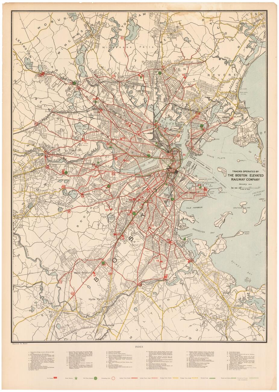
This detail from a 1916 Boston Elevated Railway Company (BERy) map shows locations of Boston's elevated railways during World War I (Source: Boston in Transit / WardMaps LLC)
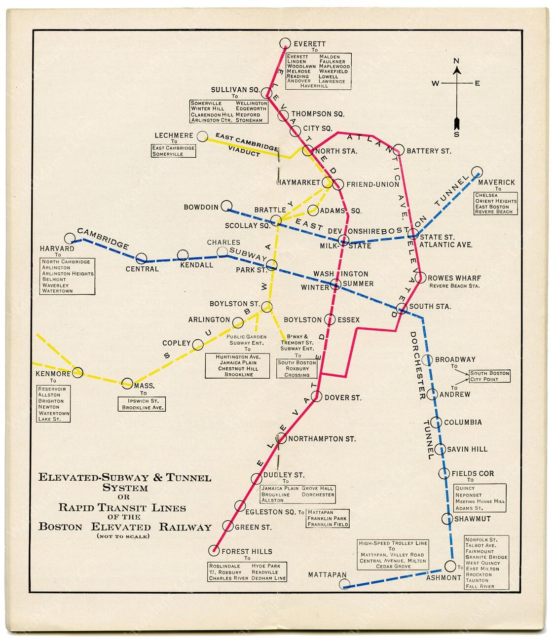
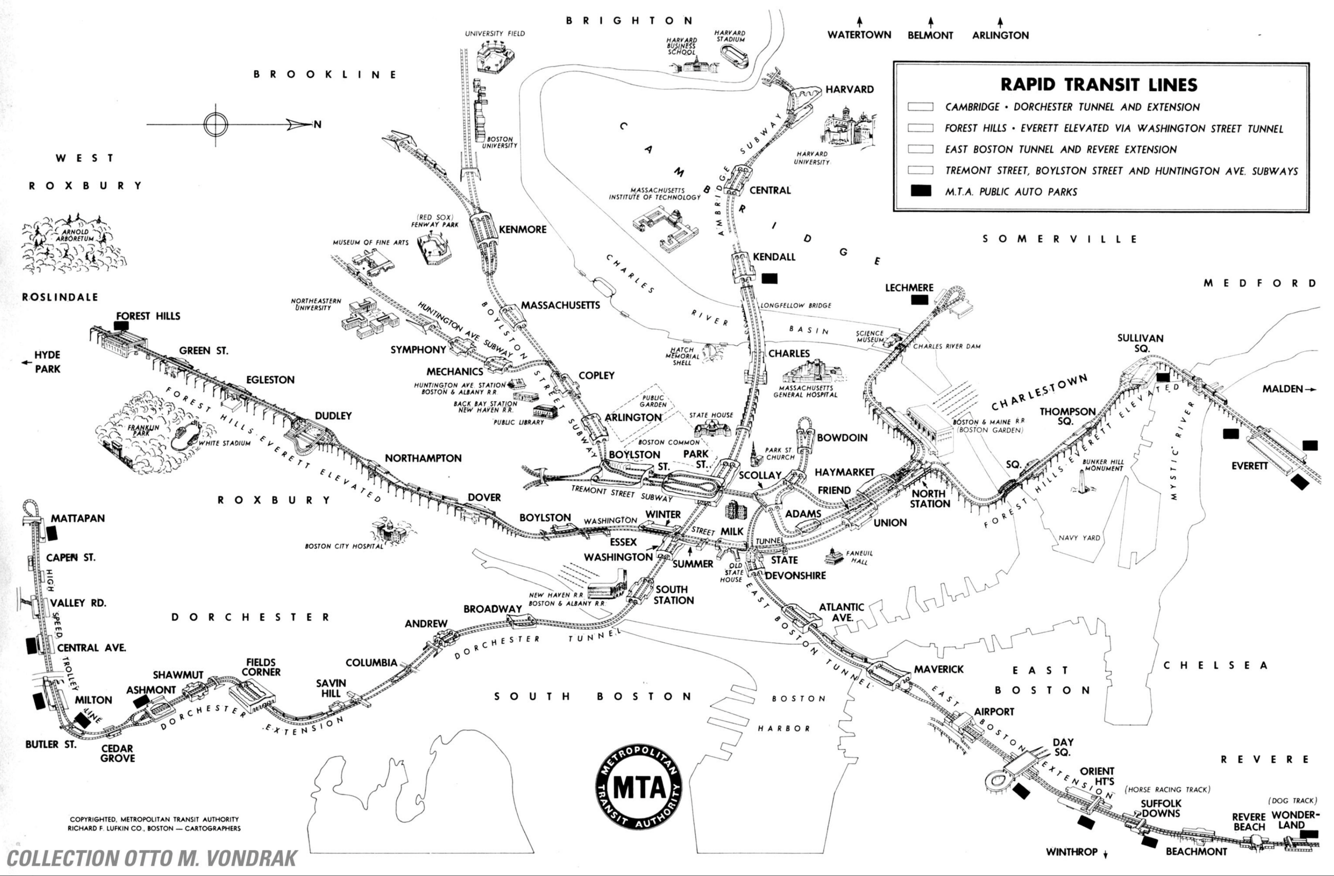
This BERy map from 1932 shows the elevated subway and tunnel system during the early years of the Great Depression—note that modern line colors weren’t selected until the 1960s (Source: Boston in Transit/WardMaps LLC)
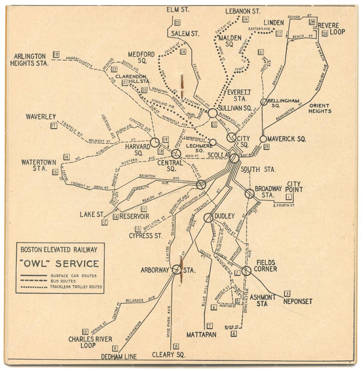
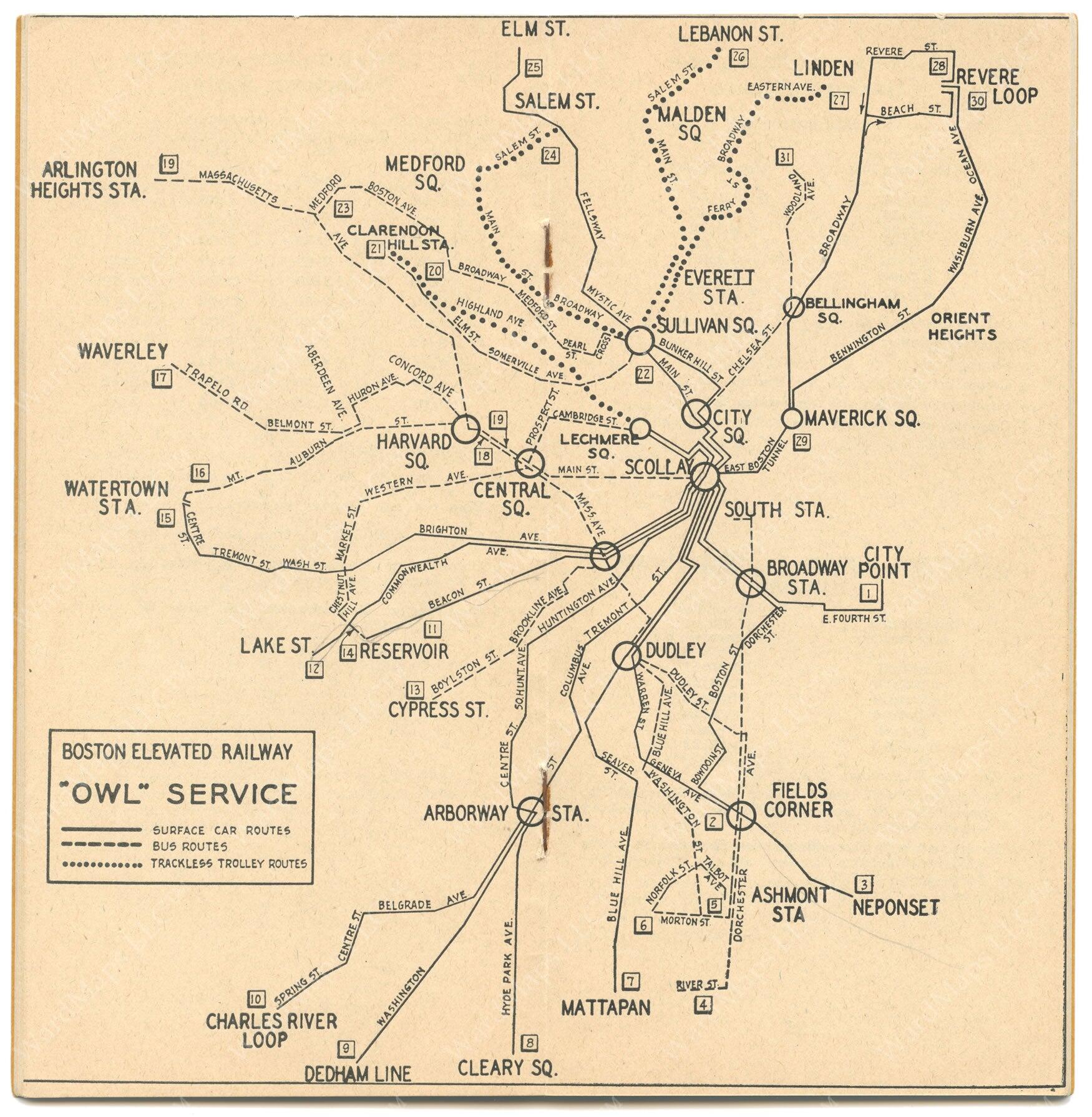
BERy and the MTA operated overnight “owl service” until 1960—this map showing night service locations is from 1947 (Source: Boston in Transit/WardMaps LLC)

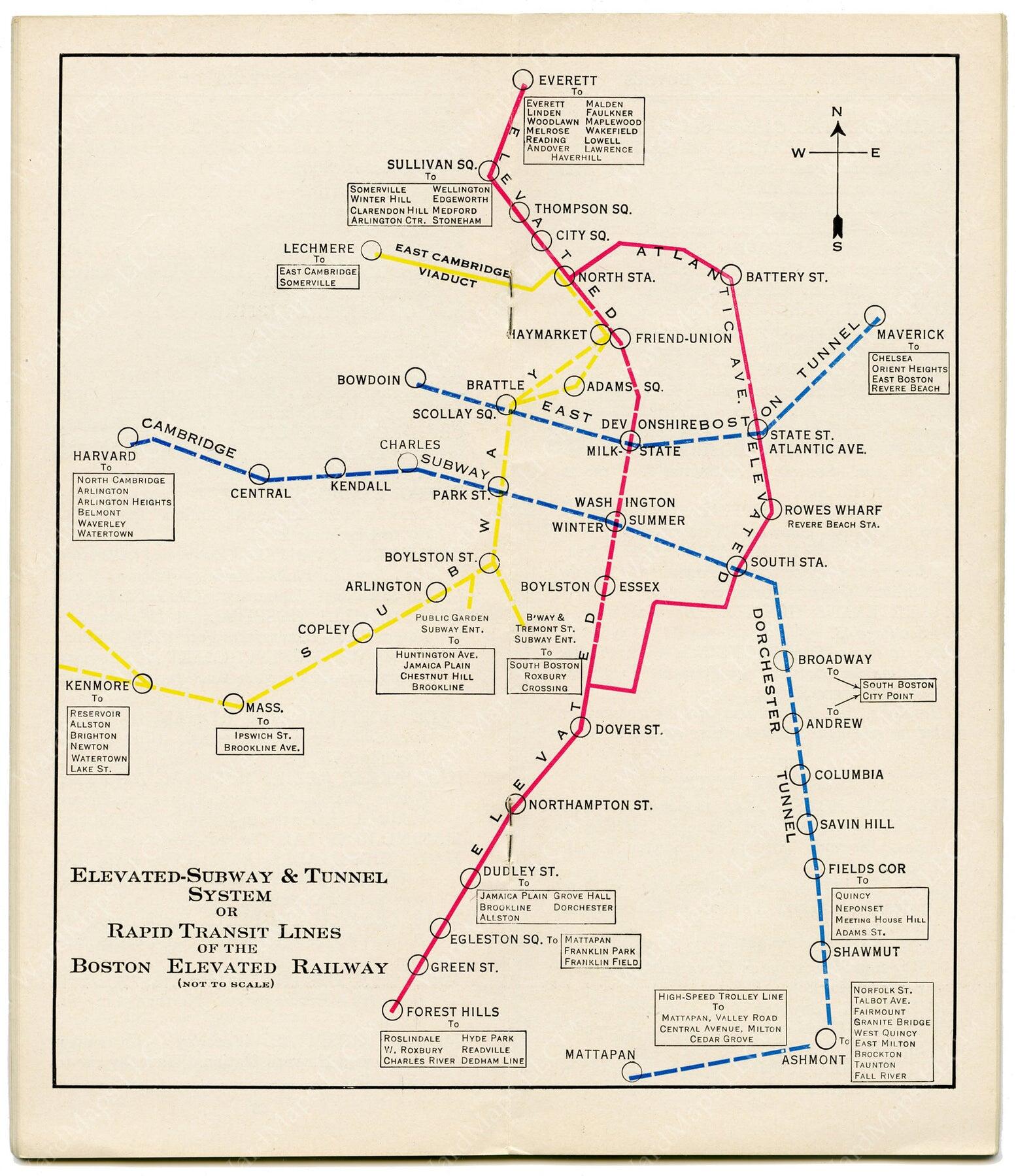
This MTA map from 1954 shows rapid transit lines then in use in the Boston area—note that the top of the map is west, and north is at right (Licensed by Otto M. Vondrak under Creative Commons BY 2.0)

The 1965 “spider map” was the MBTA’s first dedicated rapid transit-only map, and the first to use the line colors as we know them today
This 1967 MBTA map is exhaustive—and exhausting to navigate (Source: Boston in Transit/WardMaps LLC)
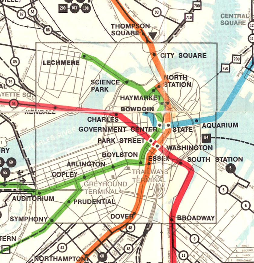
A detail showing downtown Boston from the MBTA’s 1967 full regional transit map (Source: Boston in Transit/WardMaps LLC)
This 1974 map added curves and subtle angles to the four subway lines (Source: Wikimedia Commons)

A simplified version of the subway system map was incorporated in this 1976 Commuter Rail map to provide geographical context (Source: Wikipedia Commons)

This 1995 map was the first to appear on the MBTA website
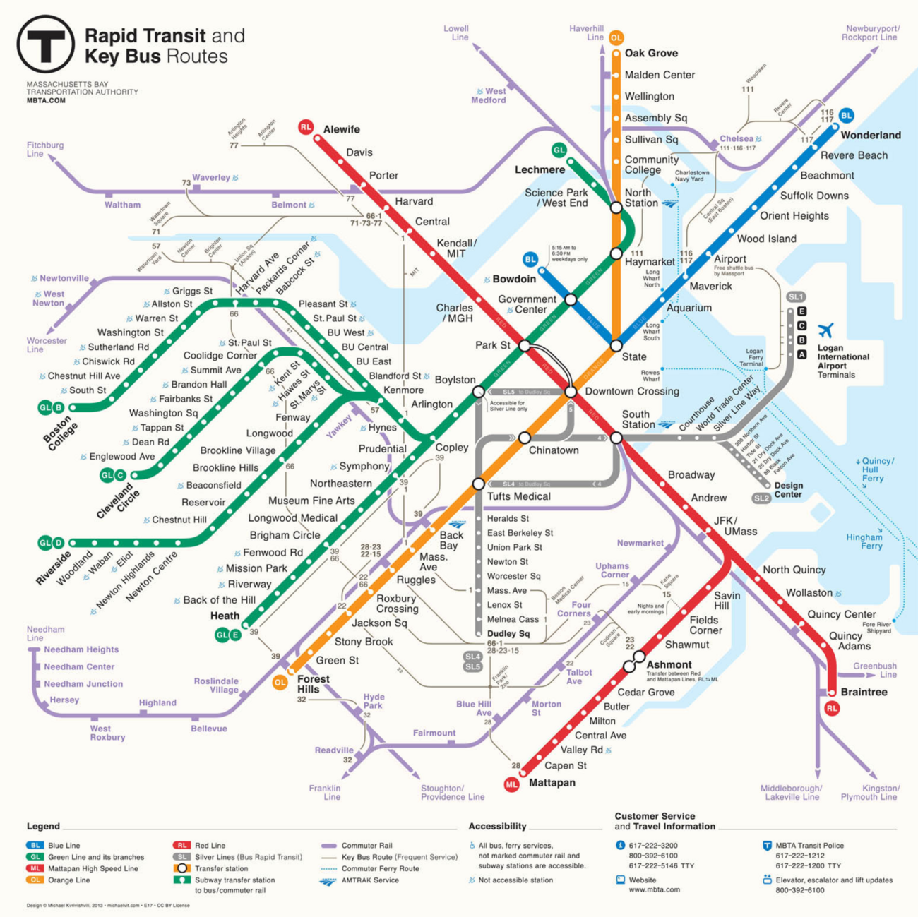
Michael Kvrivishvili’s contest-winning 2013 MBTA map

